Bluebeam Revu eXtreme 2019 – New User Interface

Whenever a User Interface is changed, or updated people seem to go nuts. “How can I change it back to Classic View?!?” The change of interface for Bluebeam Revu in 2018 was no different. I have to admit, I was a little skeptical, mostly because I teach, and I had to learn it very quickly. In this video, I will be showing Bluebeam Revu eXtreme 2019, reach out if you need help determining what version is best for your team.
Everyone I’ve trained or spoke with at trade shows loved the intuitive layout and ease of use, most of whom were self-taught. I would agree with them, as a CAD/Revit user, the tools seemed to be where I expected to find them.
Here is where I lose some of you. It wasn’t until the organization of the new interface that I realized how unorganized the old version was. It makes sense though, every year when developers built new tools or features, they had to tuck them in someplace. They did the best they could with the user always in mind.
To be honest, I see the biggest complaints coming from those who don’t use it every day.

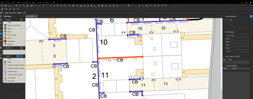
In this long-overdue video, I wanted to simply go through the interface from top to bottom and show you where tools and features are located so you can put that desire for “Classic View” behind you. I’ll also show you how I like mine set up and why.
What are your thoughts on the interface? Have you made the transition?
If you have any questions or tips you’d like to share with the global community, join the UC2 Brainery forum and work toward your Brainery Black Belt!


I want color icons back. I have a bazillion color monitor and now everything is black and white. Turns out color cues are important. And now low res icons too? What happened, EU got you to use some horrible ISO standard?
Thanks for the comment Neil, that’s great feedback for Bluebeam. Being an independent blogger I’m not associated with Bluebeam directly, but do have several friends there. As for your feedback, I did like the colored icons and would have agreed when the new interface first came out. However, now that I’ve worked in it for a few years, I appreciate the smaller icons with no color as they aren’t nearly as distracting. I’ve heard arguments both ways and bost are probably correct.
Aloha Troy… I just wanted to say Mahalo for your instructions and presentations at the recent Honolulu event. I was there and had a Great Day!!! I left with a positive feeling and knowing that I have been doing fairly well with what I know pertaining to my BlueBeam skills. I was particularly interested in the Excel collaboration, or Quantity Link, information. A confidence builder for sure and will go to the next event when BlueBeam is in town. Mahalo Again… & Stay Healthy 🙂
Aloha Dominic and Mahalo for the note with kind words. My family and I had so much fun in Hawaii, the beaches, Kayaking out to Flat Island, SCBA diving and surfing lessons to name a few highlights. The people on the island were so great and welcoming to us, and my team genuinely felt appreciated for coming out and teaching Bluebeam. Quantity Link is a fantastic tool and so powerful with combined with Excel. I’m an extension of the island forever now, don’t hesitate to reach out with questions or stories of workflows you build!
how to change to classic menu?
As customizable as Bluebeam is, you can get close, but we are not able to bring back the ribbon. Once you dive in and use it for a while, you’ll see how organized and user friendly it is.
Greetings,
Is there a workaround or a way to bring back the semi circular blue arrow buttons that would quickly expand/collapse the side and bottom panels? I’m finding I have to manually resize them.
Those are part of the old interface so we are not able to bring them back. If you hover over the area where those bullets were, you should see a blue line come active. This line performs the same as the old bullets. Thanks for the comment!